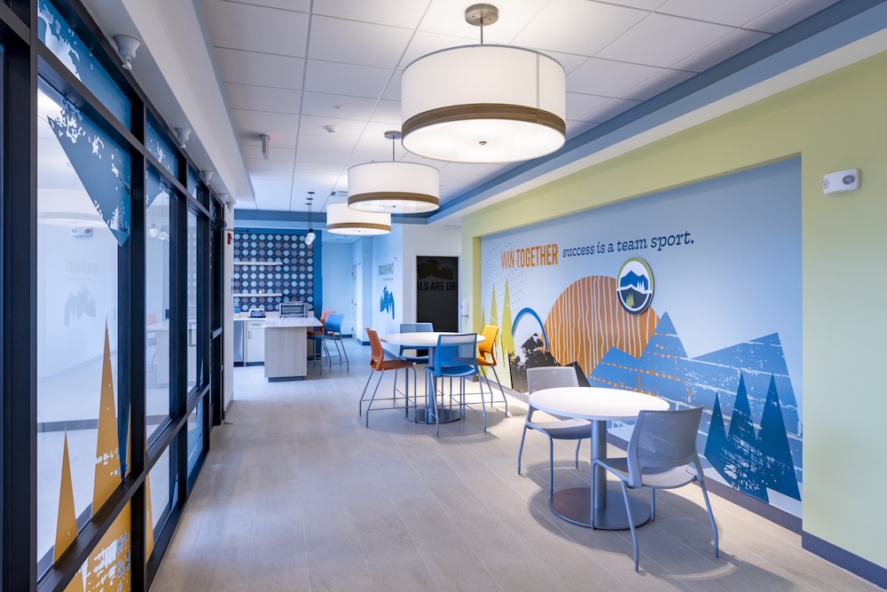
For community banks and credit unions, local relevance is part of the branch’s value.
A branch is often the most visible expression of an institution’s relationship with a community. When the branch feels like the market it serves, customers and members are more likely to recognize the branch as a part of the community.
In our work with financial institutions, branch localization is usually strongest when it’s built into the branch experience and not tacked on at the end. It may be a town name, a regional image, a community wall, a map, a local business feature, or a deeper story about the building or site. The goal is not to decorate the branch with local references, but to make the branch feel grounded in the community while still having clear institutional branding.
Start With the Brand Elements People Need to Recognize
Before designing local details, The Element Group’s design team defines what should stay consistent.
The major brand elements that help people recognize the institution immediately and create familiarity across the network include:
- Logo use
- Primary brand colors
- Exterior signage
- Monument signs
- Directional signage
- Exterior facing window graphics
Add a Local Layer
Certain branch elements create natural opportunities for localization.
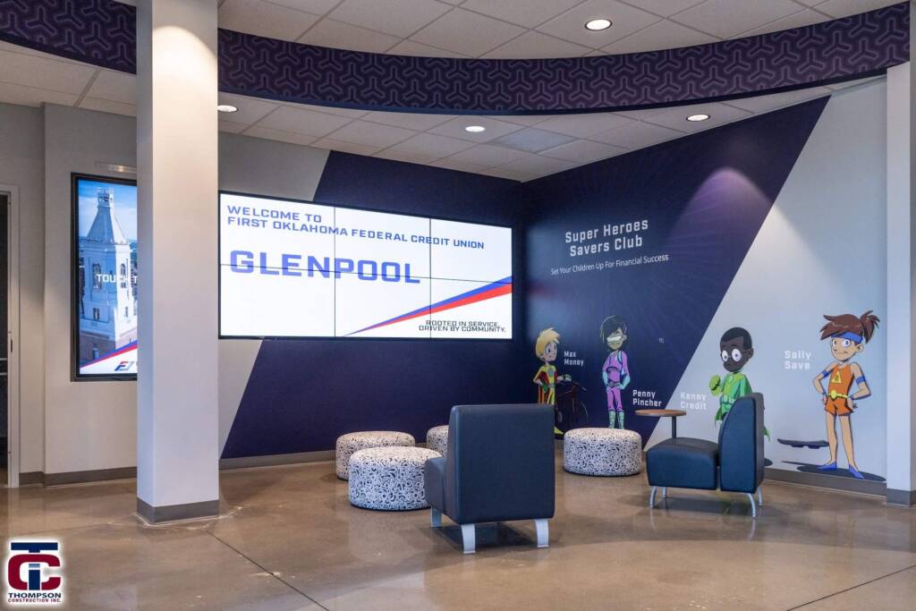
1. A Welcome Wall
The format can stay consistent across branches with branded graphic treatment, dimensional letters, and a clear message, but the local content can change for each neighborhood
2. Local Imagery
Local photography is one of the easiest ways to make a branch feel connected to its market, but it can also become generic quickly.
A strong image should feel recognizable to the people who live or work nearby. It might show the local landscape, a downtown street, a known landmark, a community event, or a place that reflects how people understand the region. The image shouldn’t feel like it was chosen because it came up first in a Google search.
3. A Community Wall
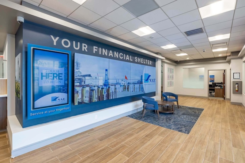
A community wall can be one of the most direct ways to localize a branch because it connects the institution to real people and real activity.
A wall can be a simple bulletin board or a more modern digital display that highlights:
- local events,
- charitable partnerships,
- branch-hosted programs,
- small business relationships,
- or photos of community involvement throughout the year.
The strongest community walls are designed to change and prevent the space from feeling static after the first installation.
4. Use Maps, Town Names, and Local Language
Localization does not always need to be elaborate.
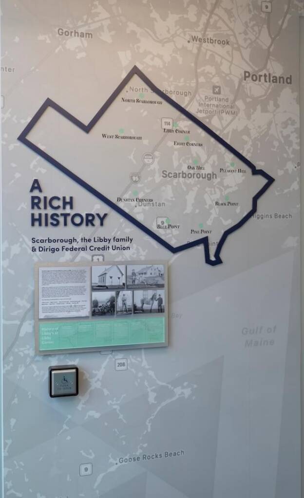
Sometimes a town name goes a long way. So does a regional map, a simple “welcome to your [town] branch” message, or language that reflects how people talk about the area.
These details work because they are immediate. They help the branch acknowledge where it is without forcing a heavy theme. They can also be easier to adapt across multiple locations because the design system stays consistent while the local content changes.
Maps can be especially useful for regional banks and credit unions. They can show the institution’s service area, nearby communities, branch relationships, or the geography members already identify with.
5. Remember That People Carry the Local Connection
Physical design can help a branch feel grounded in its market, but the staff often bring that local connection to life.
When branch employees understand the community, and ideally live in or near the market they serve, the local layer becomes more meaningful.
Localizing a branch is not only about what appears on the walls. It’s also about how the team uses the space, starts conversations, recognizes members, and reflects the institution’s role in the community.
6. Let Digital Content Support Local Storytelling
Digital displays can carry local content without requiring every update to become a permanent design decision.
A branch can use digital content to feature local businesses, promote community events, recognize nonprofit partners, share financial education programming, or show recent photos of branch activities. This gives the institution more flexibility than a fixed wall graphic.
7. Build a Kit of Parts for the Rollout
A kit of parts helps Element make localization repeatable without making every branch feel the same.
The kit may include a welcome wall, teller wall, dimensional logo, ATM surround, hours banding, drive-up graphics, community wall, digital surround, map feature, or local imagery area. Each element has a defined role, but the content can flex by location.
A new branch may support a large wall graphic with dimensional elements. An older branch may only have room for a smaller mounted panel. The same idea can still carry through, but it has to be scaled to the building.
The kit gives the institution a shared language for localizing branches. It also helps marketing, facilities, design teams, vendors, and branch leaders make better decisions and save time because they’re working from the same set of elements without redesigning each branch.
Keep the Local Layer Useful
The best localized branch design does more than signal that the institution knows the town.
It helps people feel oriented, recognized, and connected. It supports conversation. It reflects the institution’s role in the community. It gives the branch team a stronger physical setting for relationship-building.
A branch can include photography, maps, history, community events, and local business features without becoming a themed environment.
The branch should feel like it belongs exactly where it is.